March 2026 Week 2 | 10 Charts for the Week Ahead
10 Charts for the Week Ahead
The S&P 500 just posted its first three-week losing streak in a year. It closed Friday at $6632 — less than 1% above the 200-day moving average. That headline sounds bad. But the charts underneath tell a more complex story. Some of them are flashing warning signs. Others look surprisingly healthy. And the gap between them is where the real information lives.
Chart 1: S&P 500 — The Compression Zone

$SPX at 6632.19 — sandwiched between the 50-day moving average at 6881 (resistance) and the 200-day at 6608 (support). That gap is only 25 points and narrowing. The 200-day has held every test since this bull trend began. It's now less than 1% below Friday's close.
Both short-term crossovers remain bearish. The 8-day EMA is below the 21. The 21-day SMA is below the 50. Momentum has shifted to the downside — rallies are being sold and lower highs are forming since the January peak. RSI sits at 34.24, approaching oversold (30) but not there yet.
The S&P is 5% below the high. All things considered, this is a surprisingly resilient market. Taking into account the headline risk, geopolitical landscape, oil rising at historic rates, yields rising - a 5% pullback is likely LESS than one would typically expect.
Chart 2: Percent of S&P 500 Above the 200-Day Moving Average
 This chart strips away the index price and shows what the average stock is actually doing. Right now, roughly half the S&P 500 is trading below its own 200-day moving average.
The 50% level is the line between a market that's correcting and one that's deteriorating. Strong uptrends typically read 65-70%+. We peaked above 75% in late 2024 and have been grinding lower since. The decline accelerated in March as the Hormuz crisis and credit stress pulled money out of the biggest names in the index.
The names below their 200-day include Microsoft, Amazon, Meta, Tesla, JPMorgan, Netflix, Broadcom, and UnitedHealth. When your largest companies are underwater on an intermediate-term basis while the index itself is still (barely) above its own 200-day, the breadth signal is telling you the foundation is thinner than the headline suggests.
Chart 3: QQQ vs VTV — Growth vs. Value
 $QQQ is down 3.16% on the year. $VTV (Vanguard Value) is up 3.31%. That's a 6-point spread in favor of value — a reversal from the growth-dominated playbook that worked for three straight years.
Both are below their 50-day moving averages, so neither side is in a strong short-term uptrend. But $VTV is 6.5% above its 200-day while $QQQ is clinging to its own by a thread. Value isn't just outperforming — it's structurally healthier. The names driving it are the ones with pricing power in an inflationary environment: energy, utilities, staples, healthcare. The mega-cap growth names that carried $QQQ — Microsoft, Amazon, Meta, Tesla, Broadcom — are all below their 200-day averages.
If $QQQ loses its 200-day (currently $590), the rotation accelerates hard. If NVIDIA's GTC keynote sparks a tech rally Monday, it narrows. Watch the ratio, not the individual lines.
Chart 4: Sector Relative Strength — XLE vs XLK vs XLF

This chart tells you the regime. Energy +29.05% YTD. Technology -4.98%. Financials -10.74%. That's a 40-point gap between the top and bottom sectors.
In a normal correction, correlations rise and everything sells together. In a regime change, you get divergence — and this divergence is extreme. $XLE is above both its 50-day and 200-day moving averages, broke to new highs in March, and was the only sector green this week (+2.45%). $XLK and $XLF are both below their 50-day and 200-day — confirmed intermediate-term downtrends.
The full YTD leaderboard: $XLE +29.05%, $XLU +10.00%, $XLP +9.09% at the top. $XLF -10.74%, $XLY -7.16%, $XLK -4.98% at the bottom. Energy and defensives vs. financials and growth. The price action is telling you what kind of environment we're in — the headlines about oil, inflation, and credit stress are the explanation for a move that the charts showed first.
Chart 5: 10-Year Yield
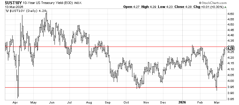
Chart 6: XLY/XLP Ratio — Consumer Health

This ratio divides Consumer Discretionary by Consumer Staples. When it's rising, consumers are spending on wants. When it's falling, they're retreating to needs. It's one of the cleanest real-time reads on consumer health in the market.
It's down 14% year-to-date.
A falling XLY/XLP ratio doesn't mean recession. It means the consumer is getting cautious. But sustained moves of this magnitude — 14% in 11 weeks — have historically preceded either a growth scare or an actual slowdown. The last time this ratio fell this fast was early 2025 Tariff Tantrum.
Chart 7: Sentiment — VIX and Put/Call


VIX at 27.19 — third consecutive week above 25. The SPX put/call ratio hit 1.16 on Wednesday. AAII bullish sentiment fell to 31.9%, below the 37.5% long-term average for the fourth straight week.
Fear is building, but it's not capitulation. The readings that would give higher confidence in a contrarian bounce — VIX above 30, put/call above 1.20, AAII bulls below 25% — aren't here yet. All three indicators are approaching their thresholds without crossing them. That's the uncomfortable zone: bad enough to tempt bottom-fishing, not bad enough to suggest the selling is done.
Chart 8: Oil — The Variable That Connects Everything

WTI at $98.45. Brent at $102.98. Every chart above is connected to this one.
Oil is why PCE re-accelerated to 3.1% (energy pass-through). It's why $XLE is up 29% (earnings torque). It's why $XLY is down 7% (gas prices compressing consumer spending). It's why UMich expectations hit a 3-month low. It's why the Fed can't cut. It's why gold is surging and Treasuries aren't. It's why the growth-to-value rotation is happening.
The Strait of Hormuz has been effectively closed for 15 days. Traffic down 97% since February 28. The IEA released 400 million barrels from strategic reserves — the largest coordinated release ever — and oil barely flinched. Saudi Arabia is rerouting through the East-West Pipeline but the capacity gap is roughly 12 million barrels per day.
This is the single variable that resolves the rest of the chart book. A sustained break above $100 reprices the inflation outlook, tightens financial conditions, and accelerates the stagflation rotation. A diplomatic or military resolution that brings oil back below $90 reverses the energy trade, relieves the consumer, and could trigger the sharpest relief rally of the year. Seemingly everything else is a derivative of what happens here.
Chart 9: Private Credit Stress
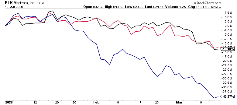
The private credit space continues to flash warning signs. Fund gating — where managers restrict investor redemptions — has spread beyond the initial wave, and the market is pricing it in. BlackRock (BLK) is down 13.18% YTD, but the real pain is in the pure-play alternatives: Blue Owl (OWL) has been cut nearly in half, down 40.27% YTD. That's not a sector rotation — that's the market repricing liquidity risk. The HYG/LQD ratio, which tracks appetite for credit risk, is essentially flat YTD, meaning investors aren't panicking out of high yield broadly — they're surgically punishing the corners of the market where redemption gates and mark-to-market opacity create uncertainty. This is worth watching closely: private credit stress that stays contained is a headwind; private credit stress that spills into broader high yield is a different animal entirely.
Chart 10: The Signal

Our long-term trend signal remains BULL. Three weeks of selling, bearish crossovers, and softening breadth — all within the context of an intact primary trend. Corrections happen within bull markets. The signal tells you the direction of the underlying trend, and that direction is still up.
What the chart book shows you is a market that isn't breaking down — it's repricing. Growth is selling while value holds. Consumers are pulling back while energy surges. Gold is working while bonds don't. Private credit is gating while public credit trades normally. Small caps and equal-weight are fine while mega-caps drag the index.
That's not crisis. It's transition. The 200-day moving average at 656 is the line that separates the two. If it holds through this week's catalysts, the setup for a tradeable bounce is building — oversold RSI, elevated put/call, intact trend. If it breaks, the character of the market changes.
The Week Ahead
- $SPX $6600 (200-day MA): The most important level on any chart. A close below it for the first time since the bull trend started would be the most significant technical event of the year. A bounce off it with volume is equally significant.
- FOMC dot plot (Wednesday 2:00 PM): First projections that incorporate $100 oil and Iran. Does the median dot move from one cut to zero? Powell presser at 2:30 PM frames the growth/inflation tradeoff.
- NVIDIA GTC (Monday open): If semis rally, $QQQ catches a bid and the growth/value ratio stabilizes. A flat-to-down reaction means the rotation continues.
- XLY/XLP ratio: Down 14% YTD. Stabilization = consumer scare fading. Continued decline = growth outlook is worse than priced.
- Oil — $100: WTI at $98.45. A sustained move above $100 changes the inflation calculus for everything. A break below $90 triggers the relief rally.
Bottom Line
Twelve charts. The S&P 500 is less than 1% above its 200-day moving average — but underneath that headline, the signals are conflicting. Growth vs. value has flipped. The consumer is weakening. Gold is replacing Treasuries as the hedge. But small caps are outperforming, public credit is stable, and the VIX hasn't broken 30. This isn't a market in panic. It's a market deciding what it wants to be next.
The Red Line is BULL. The 200-day is the line. Oil and the Iran conflict is the story. The FOMC could be a catalyst. And the twelve charts above are the map. Follow the price — the story will catch up.
Want the Signals, Model Portfolio, and Backtests?
This is the free analysis. The full dashboard gives you regime signals, monthly stock rankings, position sizing to the dollar, and 95+ years of backtested data.
Get AccessGet Weekly Market Analysis Like This — Free
Data-driven insights on macro trends, momentum, and what we're watching. Delivered to your inbox every week.